This article describes a step-by-step introduction to price corridor analysis with Excel.
You will learn the meaning of a price corridor and how to create a price corridor in Excel from a list of sales transactions in your ERP system.
Let us disclosure that our software uses AI-based data mining methods to present a B2B pricing strategy to Key Account Managers. Based on these data mining algorithms and techniques, we would like to discuss how any sales representative can create a price corridor for predictive analysis using Excel.
Setting the price right has a more considerable effect on profits than increasing sales volume or reducing costs. B2B companies today can use price corridor analysis to find the optimal price levels for thousands of sales transactions.
The development of a price corridor is a simple but effective concept in pricing strategy. It provides valuable information about the current state of pricing for all customers and products.
Let’s review together some ideas about pricing analytics and how to create a price corridor with Excel.
What is the price corridor?
Improving a B2B pricing strategy means setting an optimal price for each customer and each product. Although this type of in-depth analysis requires advanced price analytics, a price corridor is a useful first step to visualise past price developments and to apply predictive analytics using Excel.
Sales managers can use a price corridor to determine the optimal price for each customer and product.
Price corridor analysis is one of the most useful visualisations for price information and analysis.
You can build a price corridor by selecting the customers buying a particular product or product line and the average prices they pay compared to a price list. You can even add several product lines together to understand how they compare. Once familiar patterns emerge, you can react to situations outside your price corridor.
In other words, creating a price corridor is half of the work. Once you have identified a problematic price situation, you need to act. Low prices can be questionable, as much as very high prices.
Do not underestimate the significant impact that price can have on your profits. Small price adjustments can lead to substantial improvements in the lifetime value of your customers. And being price such a sensitive matter for your customers as well, very high levels can lead to unhappiness and customer churn.
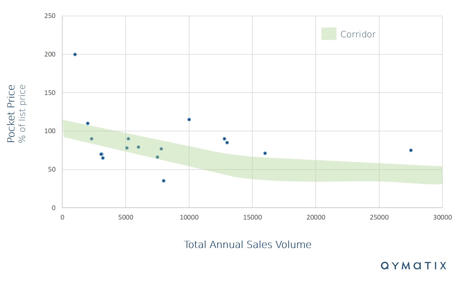
Below is an example of a price corridor. To perform the analysis correctly and consistently, you should explicitly assign all discounts and bonuses should by product or product line. You can also group customers, for example, by region or type. Transportation costs, freight costs and taxes should be flat-rated.

In the figure above, we have used a 5% deviation from the expected price levels in the corridor. The green area between the upper and lower levels is the price corridor itself. Each dot represents the average price a customer pays – also known as the price pocket.
Customers within the corridor have an acceptable relationship between the conditions granted annual sales and do not require any effort. For customers outside the green band, the conditions given here are too high in terms of revenue and the sales team should negotiate.
You can add further information to the analysis. For example, you could use the total revenue (for all products) of each customer. By showing the customer’s total revenue as the size of the circle, you will be adding a third information axis.
Now, let’s see how to build this kind of predictive analytics in Excel.
Pricing analytics step number one: prepare your data.
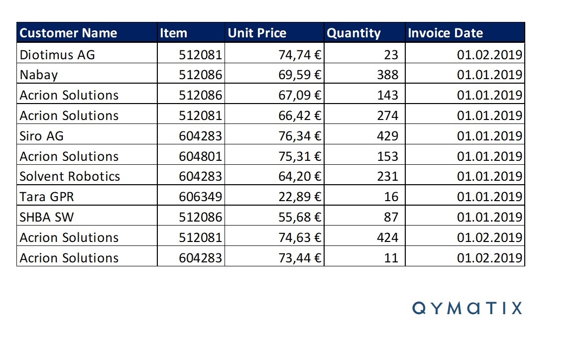
Download to excel a list of past transactions from your ERP System, to implement a B2B pricing strategy using a corridor analysis. Consider the following picture as one of many possible templates.

Now, as in any sales analytics project, define and improve the quality of your data. This step might involve normalising and understanding the meaning of the data and making assumptions about outliers.
You can filter the data over a subset of customer or products, or a relevant time range. You can omit from the pricing analytics sales transactions that fall outside a “normal” scope. Think of these cases as “outliers” or unreliable data.
Once that you have prepared the data, you can now proceed with the second step for creating a price corridor analysis in Excel.
The second step to create a pricing corridor analysis in Excel? Pivot your sales transactions
You can now click on “create pivot table” on the left corner of your Excel program and create a pivot table.
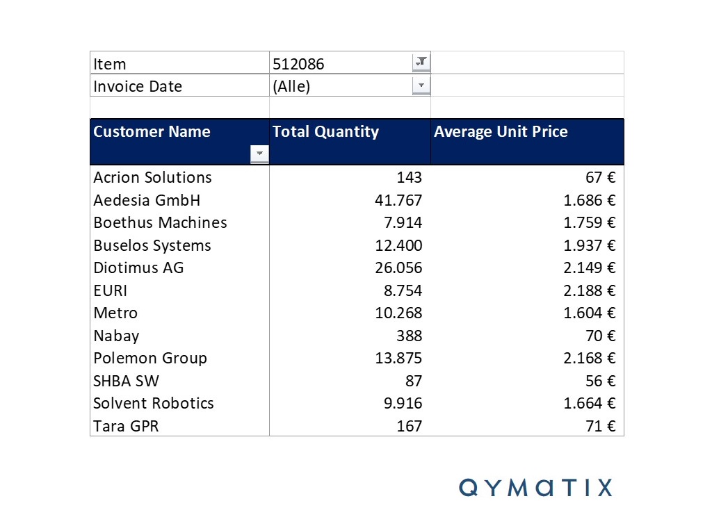
To apply the predictive analytics method that we are discussing here, you will need to group your transactions by average price, quantity. If you haven’t done it already, you can also select here a time range or filter different product lines. Let’s assume for a moment that you have defined a time range and picked a product line. Your pivot table should look like the one below:

The final step is now to add a chart over this consolidated pivot table. Simply select the table and click into “add chart”. Select the chart-type “points” (or bubbles, if you want to add a third axis). The resulting image should look like the one below.
Pricing corridor analysis in Excel, the final step.
Controlling and analysing a pricing strategy requires an understanding of the price levels your customers are paying. If a company has thousands of produces and customers, pricing analytics can become a unique challenge. You can partially solve this problem with a price corridor analysis.
After you added a chart, you should now be able to see the price corridor. You can also add a form over the graph to make the corridor easier to visualise.
You can repeat the example for different products and time-ranges. Most corridors should follow a “normal” shape, with average pocket prices decreasing with higher quantities. Some products, however, might not follow this standard shape.
Successful sales leaders understand that analytics are a means to an end. Pricing analytics is there to help you improve your pricing strategy, not to look at a static, beautiful dashboard. In short, you should apply the pricing insights you have just acquired.
CALCULATE NOW THE ROI OF QYMATIX PREDICTIVE SALES SOFTWARE
How to use a B2B price corridor in Excel to improve your pricing strategy
We need to make three crucial points at this stage. First, we work with the given assumption that you can modify your prices. Some practitioners would define this action as an example of B2B dynamic pricing. Maybe it is.
Just remember that all prices are dynamic, some are more dynamic than others.
Second, we need to understand that not all your customers have the same sensitivity to price increases and that not all your products might have the same price elasticity. You could predict or describe price elasticity with a similar price corridor analysis using broader data sources.
Lastly, setting prices is not a one-off shot. You need to find a way to operationalise pricing analytics and its resulting actions.
Now back to the price corridor in excel. There are different ways to use and interpret a price corridor. First, look for the outliers on the corridor: those customers way above or below the price corridor.
Customers above the corridor are paying more for the same product. There could be several reasons behind this situation, assuming the data is consistent across all customers. It is for some companies a pleasant situation, but it could still spell trouble, shall the involved customer find out about it.
Customers below the corridor also represent a problematic situation. Sales managers should analyze the situation and investigate the reason for it. But most importantly, they should be able to contact the customers in question before the company starts to be in the red.
Ultimately, instead of setting prices without discrimination of sales volumes, a sales manager can offer fairer prices to more essential customers. Split pricing analytics into specific steps and look for situations outside the price corridor. By prioritising, you save valuable time and effort.
This level of detailed analysis enables sales managers to set final price targets by customer. It also helps them quickly identify problematic prices and prevent incorrect prices in the long term.
Remember the level of business impact that price analysis can have on your results. A 5% increase in pricing can increase the average company’s profits by 50%. The same improvement in fixed costs, variable costs or sales volume would change earnings by 15, 20 or 30% respectively.
Example of a price corridor analysis in excel – Conclusion:
Price analysis, a key challenge for mid-sized companies, uses a collection of data mining methods and analytics. Sales leaders can use a price corridor to describe complex pricing situations and to set the optimal price for each customer and product.
Excel is very flexible software for price corridor analysis. With some time and basic knowledge of data mining, a sales manager can, for example, successfully prioritise price negotiations with Excel. There are, of course, alternatives to Excel for price analysis.
In this article, we introduced some basic concepts of price analysis and how to create a price corridor in Excel in three easy steps. First, select the sales data and transactions you want to analyse. Second, create a pivot table using the sales volume and average price pockets. Finally, insert a scatter or bubble chart and visualise the price corridor.
We also discussed the need to define a suitable pricing strategy for your organisation and to consider price elasticity of your products and market. Besides, successful managers implement and operationalise pricing analytics as an on-going sales process, and not just a one-off action.
Tell us how relevant pricing is for you.
